Best monitor settings for color accuracy
How to
Here’s a breakdown of the most important monitor settings for color accuracy and the suggested options for each.
Each monitor has different settings so there’s no universal generic answer on what is the correct configuration, but there are guidelines that apply to every model.
There are 4 key settings available on almost all standalone displays: luminance, gamma, color temperature and color gamut. Let’s focus on those.
 1) Reset all settings
Step one is to reset the monitor to factory defaults and begin with a clean slate. It’s also important to let it warm up for 30 minutes to ensure color response and brightness are stable.
2) Luminance or backlight brightness
The luminance or backlight brightness setting adjusts the intensity of the light projected by the monitor through the LCD layers that make each primary color. In other words, it controls how bright the monitor will look.
Our goal here is to match room and monitor lighting so both look balanced. For the best results in professional environments it’s also important to match the room lights’ color temperature and even the wall colors. Our eye adapts to the surrounding environment and all those factors can alter the perception of color.
Adjust the monitor according to your work environment and vice-versa. Focus on getting the room lightning right first, and then adjusting the display. Always try to use lights that are close to 5000K in color temperature, which is neutral and not overly warm, yellowish, or cool, blueish.
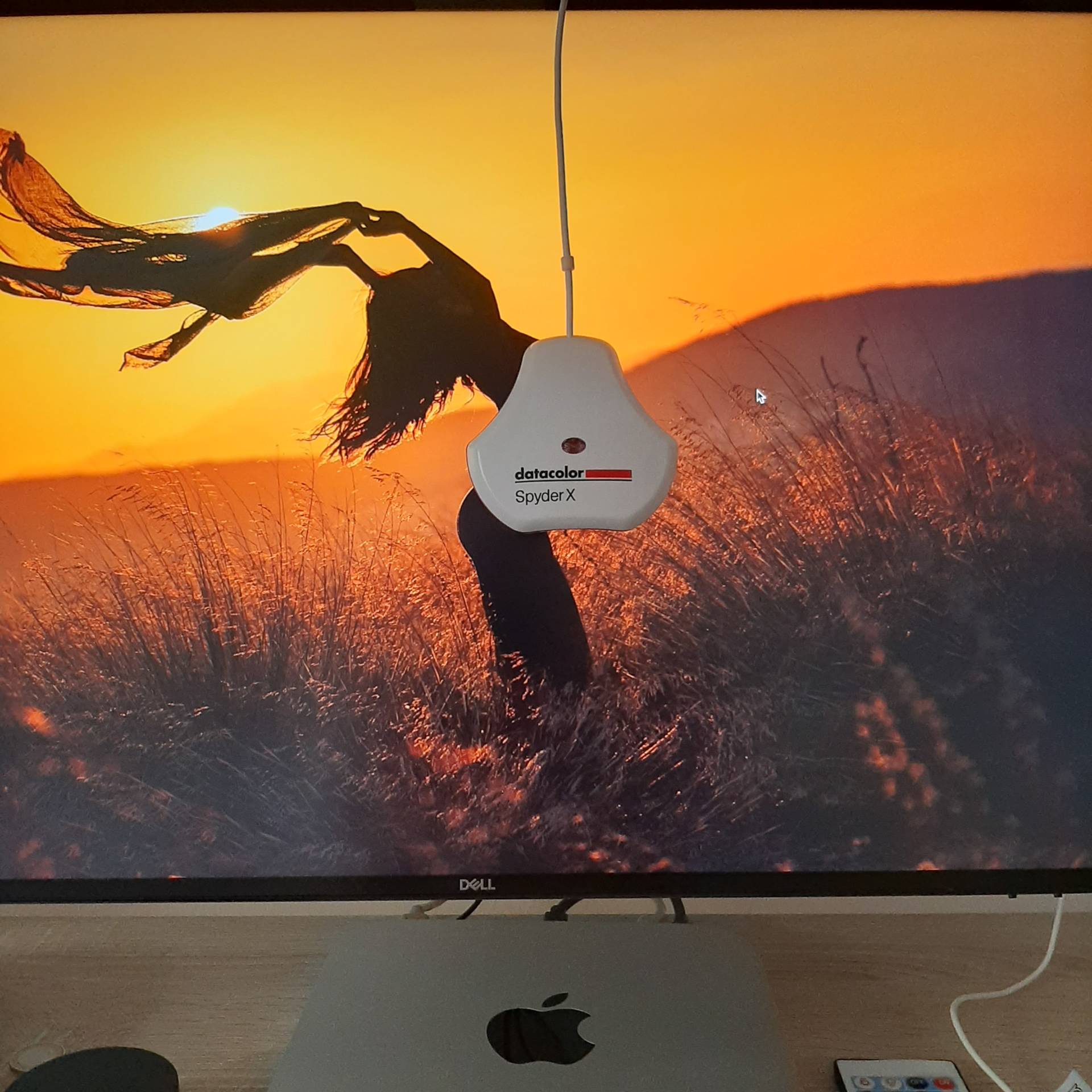
The ideal luminance range for color accurate work ranges from 80 cd/m2 to 140 cd/m2 or nits. But that’s only possible to measure with a hardware device, either a colorimeter or spectrophotometer.
Without a colorimeter, the best guidance is to match monitor and room brightness in a way that neither looks too bright compared to the other. Always avoid cranking up backlight brightness too high unless there’s a good reason for it.
Most people tend to run their monitors too bright and the recommended values may seem dim at first, but that’s the range that can more closely match a printed photograph and the eyes quickly adapt to it.
Why are my prints too dark?
If you ever asked that, there’s a high chance your monitor is set up too bright. Displays emit light and paper reflects it. It’s easy to set up monitor brightness too high and overpower the amount of light a print can reflect to your eyes, making it look darker.
3) Gamma
Hey, don’t look up monitor gamma correction on Wikipedia unless you’re a physics major. Seriously.
The simple explanation is that gamma is a correction curve used to distribute the intermediate tones in an image. A gamma curve of 2.2 more closely matches our visual perception of tones and is the most common standard used for photo editing, design or general computer usage.
In the past, Mac computers had a default gamma value of 1.8 which matches more closely commercial printing, but nowadays MacOS uses gamma 2.2 just like Windows and most other operating systems.
Select the 2.2 gamma preset on your monitor on-screen display.
4) Color temperature
Along with backlight brightness, this is the most important setting to get right.
The short answer is: select the 6500K preset.
The long answer is a bit more nuanced.
Color temperature is measured in degrees Kelvin. The higher the value, the cooler and blueish is its going to look. Conversely, lower Kelvin values will look warmer and yellowish.
As a frame of reference, old incandescent light bulbs are around 2700K while cool white fluorescent tubes (think bad kitchen lights) are over 7500K. A cloudy sky in an overcast day is about 6500K.
It was very common 15 years ago for computer monitors to have high native white points, looking very cool compared to natural lighting, specially the first affordable LCD displays. LED backlights evolved a lot since then and most monitors nowadays are close to 6500K.
The most common monitor native color temperature, also called white point, is 6500K. That’s the color temperature used on the two most popular standards for monitor color: sRGB and rec. 709 (ITU-R BT.709).
sRGB was developed by Microsoft and HP in 1990’s and represents typical office or home viewing equipment and conditions. It has a small color gamut that can be accurately reproduced by almost all devices. Think of it as a minimum common denominator that all modern displays can cover.
Rec. 709, also known as Rec.709, BT.709, and ITU 709, is a standard developed by ITU-R for characterizing color response in HD television. It’s the most common standard for video. Primary color coordinates are identical to sRGB, as is the white point at D65 (effectively 6500K), but the gamma curve is different.
The two most common wide color spaces, DCI P3 and Rec. 2020, used for HDR video, also follow the D65 white point.
What we want is to match those standards as closely as possible, thus the recommendation to select 6500K for the monitor white point.
Don’t worry if you’re working on a screen without color temperature controls, laptops or iMacs, for example. Most modern good quality LCDs are close to 6500K.
Using 6500K is a great starting point, but there are reasons to stray from it in special cases. For example, a slightly lower color temperature around 5500K can provide a better screen to print match for your particular work environment.
D65 or 6500K?
Wikipedia has a good article about the D65 standard illuminant and Parker Plaisted has a couple of articles going deeper into it.
For simplicity’s sake, we can safely assume that the 6500K preset on the monitor is the one that will match more closely the D65 theoretical color used on those standards.
5) Color gamut
Monitor color gamut is the range of colors a particular display can produce. The wider the gamut, the more vibrant and saturated colors will look to our eyes.
Most standalone monitors have controls for color gamut. We’ll usually find at least a sRGB preset and individual red, green and blue controls to run it on the unconstrained native gamut. Wide gamut displays often have additional options, such as AdobeRGB and DCI-P3.
Stick to the sRGB preset if not working on a fully color managed workflow. That option will be as close as possible to the sRGB color space, which is how all operating systems treat untagged images and devices without custom color profiles.
When using a monitor calibration tool it is advisable to select the native preset, or better yet, the individual RGB controls and have access to the full monitor gamut. The resulting ICC profile will accurately describe the monitor gamut so the OS and any color managed app can adjust the output and get accurate colors from it.
Setting up the monitor on a wide gamut preset, such as DCI-P3, but not using color management is the cause for oversaturated monitor colors. The operating system will treat that device as sRGB, but the actual gamut is much larger. In other words, a saturated red color on a wide gamut display is much more vibrant than on a sRGB one and without a custom ICC profile the OS cannot compensate for it.
On the other hand, calibrating a wide gamut monitor using a constrained preset such as sRGB leaves a lot of potential on the table by not using the full monitor color gamut.
6) Avoid the traps
Sometimes monitors offer dynamic modes that can alter contrast or color response based on the content displayed. That’s a bad idea for color critical work and the opposite of what we want, which is having constant and repeatable color.
Disable any dynamic modes, like dynamic color or contrast, or even local backlight dimming, unless your monitor has a ton of backlight zones and can do a great job with it. Most don’t.
Same for modes that cut blue light. On the same note, make sure to disable Night Shift and auto brightness modes on the MacOS settings and the equivalent options on Windows 10 with the Night light and auto brightness settings.
Do not touch the contrast control and leave it at the default setting. Changing contrast internally often means clipping the darkest or lightest tones, losing information from those areas.
Same for sharpness or scaling. Keep the default settings and always use the monitor at its native resolution.